Hello, cherished readers of Ambrosia, your editor here, as we turn our gaze towards an element of our world often taken for granted, yet one that holds profound sway over our inner landscapes: color. We experience it constantly – in the vibrant hues of a sunrise, the calming blue of the sky, or the invigorating green of nature. But is color merely a visual phenomenon, a simple adornment to our surroundings? At Ambrosia, we believe it’s far more. Color, in its silent eloquence, possesses a remarkable ability to influence our moods, energy levels, and even our physiological responses, weaving an invisible tapestry that shapes our well-being.
In a world increasingly seeking holistic paths to health, understanding the subtle yet powerful impact of color offers a fascinating new dimension to our pursuit of vitality. Today, we’re diving into the intriguing realm of color psychology and chromotherapy, exploring the science behind how different shades resonate with our bodies and minds, and how you can consciously harness this “silent language of light” to cultivate a more balanced, harmonious, and vibrant life.
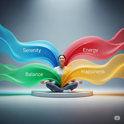
Image:Generated by AI(Gemini)
1. The Science and Psychology Behind Color’s Influence
The idea that colors affect us isn’t just anecdotal; it’s rooted in both evolutionary biology and psychological conditioning. Our brains are hardwired to associate certain colors with specific meanings, partly through universal human experiences and partly through cultural learning.
- Evolutionary Associations: Think about it: a bright, fiery red often signals danger or passion – much like a warning fire or flushed cheeks. The soothing blue of a clear sky or calm ocean often evokes serenity and spaciousness. The vibrant green of lush vegetation speaks of growth, renewal, and health. These primal associations are deeply embedded.
- Cultural Conditioning: Beyond evolution, our cultural upbringing shapes how we perceive colors. While white might symbolize purity in many Western cultures, it can signify mourning in some Eastern traditions. These learned associations contribute significantly to our emotional responses to color.
- Beyond the Mind: Physiological Responses: The impact isn’t just psychological. Exposure to different wavelengths of light (which we perceive as color) can trigger real physiological changes:
- Brainwaves and Hormones: Blue light, for instance, is known to suppress melatonin production, helping us feel awake during the day but potentially disrupting sleep if viewed on screens at night. Conversely, warmer, redder light towards evening can support the natural winding down process.
- Heart Rate and Blood Pressure: Studies have indicated that warm colors like red can stimulate the nervous system, potentially leading to increased heart rate and blood pressure, whereas cool colors like blue may have a calming effect, lowering these metrics.
- Appetite and Metabolism: This is why fast-food restaurants often use reds and yellows – these colors are thought to stimulate appetite and create a sense of urgency. Cooler colors like blues and purples, conversely, can have an appetite-suppressing effect.
2. Decoding the Emotional Palette: How Specific Colors Speak to Us
Each color in the spectrum carries its own unique energy and psychological resonance, like different notes in a grand symphony. Understanding these can empower you to intentionally choose colors to support specific states of being.
- Red (Energy, Passion, Action): This bold color is often associated with warmth, excitement, and heightened energy. It can be stimulating and may increase alertness, making it suitable for spaces where dynamism is desired. However, too much red can also evoke aggression or intensity.
- Orange (Creativity, Enthusiasm, Joy): A vibrant and friendly color, orange combines the energy of red with the happiness of yellow. It often encourages social interaction, creativity, and enthusiasm, bringing warmth and optimism to a space or outfit.
- Yellow (Happiness, Optimism, Clarity): Sunny and bright, yellow is linked to cheerfulness, mental clarity, and focus. It can be uplifting and stimulate intellectual activity, though overly bright or excessive yellow might sometimes lead to irritation.
- Green (Harmony, Growth, Balance): As the color most abundant in nature, green brings a sense of calm, balance, and renewal. It’s often associated with healing, growth, and tranquility, making it ideal for relaxation areas.
- Blue (Serenity, Trust, Calm): Evoking the sky and ocean, blue is known for its calming and soothing properties. It can reduce stress, promote relaxation, and enhance feelings of trust and stability, making it perfect for bedrooms or professional settings.
- Purple (Wisdom, Spirituality, Luxury): Historically associated with royalty, purple often signifies luxury, wisdom, and spiritual depth. It can be both calming and stimulating, fostering creativity and introspection.
- Pink (Love, Compassion, Gentleness): A softer, more nurturing shade, pink is universally linked to love, compassion, and tenderness. It can create a sense of comfort and reassurance.
- White (Purity, Simplicity, Freshness): White is often associated with cleanliness, new beginnings, and simplicity. It can make spaces feel larger and brighter, providing a sense of clarity and order.
- Black (Power, Sophistication, Mystery): A powerful and timeless color, black often conveys sophistication, elegance, and authority. While it can be dramatic, excessive use might sometimes feel oppressive.
3. Ambrosia’s Spectrum of Well-being: Cultivating Color in Your Life
Armed with this understanding, how can you consciously weave the power of color into your daily life to enhance your well-being? It’s about intentionality and creating environments that resonate with your desired state.
- Thoughtful Home & Office Design: Consider the purpose of each room. For a calming bedroom, opt for soothing blues or greens. For a vibrant kitchen or creative workspace, hints of orange or yellow might spark inspiration. Even small touches like cushions, artwork, or a painted accent wall can make a significant difference.
- The Power of Your Wardrobe: Your clothes aren’t just fabric; they’re a personal statement and a tool for self-expression. Choose colors that align with your daily goals or mood. Need a confidence boost? A power red or a solid navy might be your go-to. Seeking tranquility? Soft blues or earthy greens can set the tone.
- Colorful, Nutritious Eating: “Eat the rainbow” isn’t just a catchy phrase for kids; it’s a powerful principle for optimal nutrition. The vibrant colors in fruits and vegetables often indicate the presence of diverse phytonutrients and antioxidants essential for health. A plate rich in reds (tomatoes, berries), greens (spinach, broccoli), oranges (carrots, sweet potatoes), and purples (eggplant, grapes) ensures a broad spectrum of benefits.
- Mindful Engagement with Nature: Immerse yourself in the colors of the natural world. The verdant greens of a forest, the deep blues of the ocean, the golden hues of a sunset – these natural palettes are inherently healing and restorative, offering a direct pathway to calm and rejuvenation.
- Exploring Chromotherapy (Color Therapy): While not a substitute for conventional medical treatment, some holistic practices utilize specific colors of light to influence mood and well-being. This might involve colored lights in therapeutic settings or even colored glasses. Always consult a qualified practitioner if considering such therapies.
Conclusion: Painting Your Path to a More Vibrant Self
Color is so much more than just what meets the eye. It’s a fundamental energy that surrounds us, a silent language that whispers to our subconscious, subtly shaping our emotions, thoughts, and physical state. By cultivating a deeper awareness of this fascinating phenomenon, and by intentionally incorporating the power of color into your living spaces, your wardrobe, and even your plate, you unlock a new dimension of self-care.
At Ambrosia, we believe that true well-being is an art form—a masterpiece crafted from conscious choices. Embrace the spectrum, experiment with its hues, and allow the vibrant language of light to paint your path towards a more balanced, harmonious, and exquisitely vibrant you. After all, life is meant to be lived in full color.
Disclaimer: This article is intended for general informational purposes only and does not constitute medical advice. It should not be used as a substitute for professional medical diagnosis or treatment. If you have specific health concerns or chronic conditions, please consult with a qualified healthcare professional for appropriate diagnosis and treatment.
답글 남기기